Double Coin Imaging Awards
Cleverly subtle, historically Higgins
Double Coin Imaging Awards
Some fleet colour schemes are impossible to miss...they’re in your face to the max.
Others are more subtle, less spectacular at a casual glance – but incorporating some clever graphic design elements.
And in the case of Palmerston North-headquartered Higgins Concrete, this month’s finalist in the PPG Transport Imaging Awards, you can also throw in a fascinating back story.
As a standalone entity, the company is a very young one, dating back only to the sale of the Higgins Group to Fletcher Building, early in 2016.
However, the deal didn’t include the concrete division and the Higgins family’s real estate holdings – and one of the conditions of the sale was that Higgins Concrete would retain the distinctive H that for so long had been the centrepiece of the Group’s logo.
However, explains Higgins Concrete managing director Shane Higgins, that condition only lasts while the family owns the company: “If we sold to a third party, the name and branding would have to change immediately.”
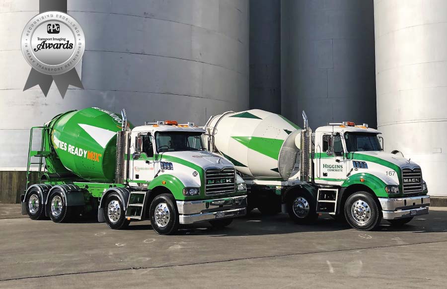
So, here was a brand-new company with no more than an immediately recognisable logo and the need for a colour scheme. As part of the Higgins Group, the concrete division had carried the same dark green of the parent company on truck cabs and tipper bodies, and used plain white on the mixer bowls.
Green was still the preferred base colour for the new scheme, explains Shane Higgins – but, naturally enough, quite different from the original Higgins shade: “We made the decision to start with a base of Bright White, because that is what our European-sourced Macks and Volvos come with from the factory anyway – and our Hinos can be repainted in that easily. After that it’s all vinyl graphics.”
The design project was handed to Capture Signs of Palmerston North, which produced a clever answer that incorporates a random pattern of several shades of green on all the areas where vinyl is applied.
Capture Signs general manager, Nigel Rook, explains that the effect is created using Adobe Illustrator: “You put some different shapes into the programme and it creates a pattern in which you can spot-fill the colours.”
The signature colour of the design is 3M Dark Green (despite its name, significantly lighter than the original Higgins Group colour), while 3M Apple Green and a couple of intermediate tints produce the patterned effect.
The design hints at the varying greens of the Manawatu farmlands and the Ruahine Ranges of the company’s home territory. It features on every vehicle in the fleet – utes and vans as well as the bulk aggregate units and the readymix trucks.
Rook explains that on the back of the bulk trucks the pattern is printed onto clear vinyl: “That means that where the colours are lightest, the alloy of the tipper body underneath shows through. It’s very effective in bright sunlight.
“All units but the mixers carry the big Higgins H at the rear. We couldn’t put it on the mixer bowls because it would have looked too busy, but it’s on all the smaller vehicles – utes, vans and the like – as well as the aggregate trucks.”
The logos are printed in a grey pattern that’s evocative of concrete aggregate, and are reflective, adding oomph at night and in low light.
Where, before the sale to Fletchers, the mixer bowls were plain white, now they carry a diamond pattern in the base green, making the Higgins Concrete units unmistakable on the road.
The colour scheme design doesn’t stop with Higgins Concrete though: The company now owns northern Wairarapa’s Prenter’s Aggregates, and has a majority stake in Counties Readymix, both long-established in their regions.
The Higgins family doesn’t want to lose the historical strength of these companies, but has cleverly introduced the same pattern effect to the 3M Bright Green of the Counties units and the previously all red Prenter’s trucks. Both companies retain their longtime names and logos, while the previously all-green mixer bowls of Counties now carry white diamonds – with red diamonds for the previously white Prenter’s bowls.
And there’s a final unmissable flourish for the design. Higgins Concrete is a major supporter of the Child Cancer foundation, and one of the mixer units has been decked out using the charity’s distinctive pink as the base for the patterned effect.

 + EQUIPMENT GUIDE - FREE