Double Coin Imaging Awards
An evolutionary livery
Double Coin Imaging Awards
Looking at older photos of Waimea Contract Carriers trucks and comparing them with their current counterparts offers a fascinating glimpse of how trucking fleet colour schemes evolve.
The primary colours from more than 30 years ago remain: Teal green and yolk yellow over a base white….but the green has morphed from a flat finish to metallic, and the yellow now plays a less dominant role.
And in the past decade, new colours have been added – charcoal/gunmetal, a silver that's almost chrome, a lighter teal, plus black keylines. It's a mixture that sounds like it could have ended up as a real dog's breakfast...yet it works.
The latest additions to the 60-strong Waimea lineup present an assured – and deceptively simple – face to the world, making the Nelson-area logging operation a solid finalist in the PPG Transport Imaging Awards.
That the same colours work well in a totally different design is evidenced by the three units of the subsidiary Waimea Heavy Haulage, incorporated around seven years ago to shift forestry equipment, but since then broadening its scope.
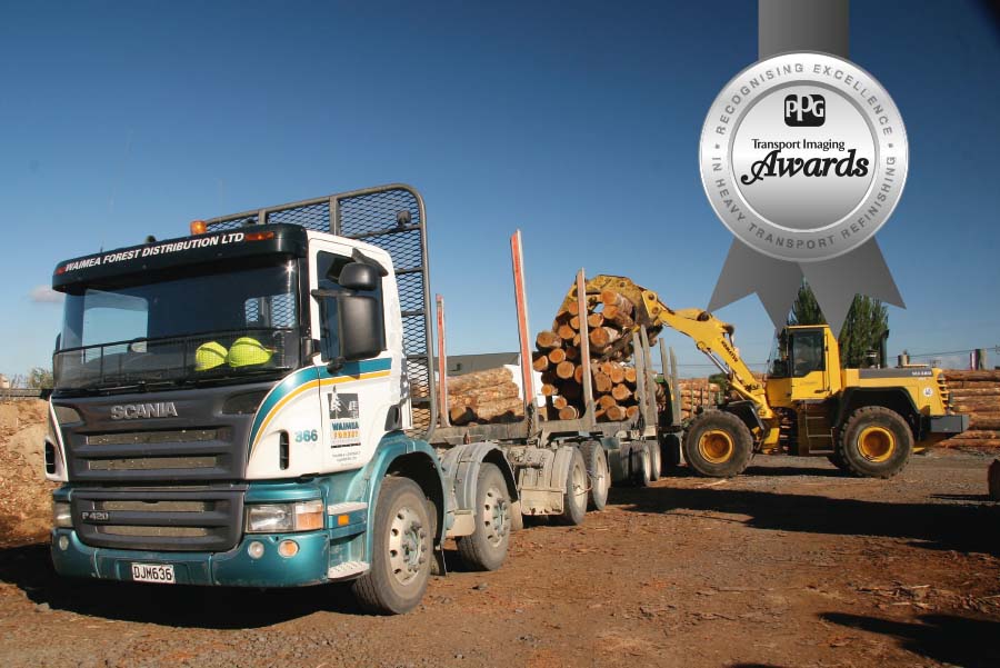
Where the primarily cabover Kenworths and Scanias of the Waimea Contract Carriers fleet use curved stripes, on the Kenworth conventionals in the heavy haulage division the charcoal is up front – cutting back to the teal in a series of horizontal sawtooths.
When the late Simon McIntyre set up the company in the mid-1980s, the zigzag teal and yellow bands matched the square cabs of the era. As Peter McIntyre – a co-director of the company with his sister Jenny since their Dad's death in 2011 – says: "It was pretty old-school, but typical of the time."
The colour scheme disappeared in 1998, replaced by the all-yellow of the G4 consortium, set up as a key supplier for Weyerhaeuser, which at the time managed most of the forests in the area. The G4 concept lasted for around six years, and Weyerhaeuser soon after sold its interests, leaving the four contractors in the federation to progressively shift away from the G4 yellow and rebrand their individual fleets.
Waimea Contract Carriers picked up its original colours, with the teal now metallic and primarily on the bottom, and a curved teal and yellow stripe below the window level.
With many of the units staying yellow for some time, a strong company logo was seen as critically important. The base design for this was sketched out by Simon and company CFO Phil Harris on a napkin after a few beers at the pub. Their impromptu design session came up with a rectangle with a tree in silhouette and the rear end of a logging trailer – both in white against a dark grey background….above the company name in yellow and black.
On the face of it, the very distinctive logo could easily have failed to work all that well with the rest of the colour scheme….but it does.
The next major change to the colour scheme occurred late in the 2000s, recalls Peter: "I'd been saying to Dad that we needed to jazz it up a bit. Anyway, we went to the Formula One meeting in Melbourne and one of the race teams – I think it might have been Mercedes – had something that was very close to our teal green and yellow, along with charcoal grey and silver. We thought, 'this will do us' and came home and started planning."
Richmond-based Design Art worked with the McIntyres to produce the new scheme.
In its latest iteration, as worn by the Kenworth K200 on this month's poster, the livery is deceptively simple – the absence of the fancy scrollwork that's a feature of many other fleets partly accounting for this impression.
But then you get up close and discover quite intricate detail. From the white background above, the main stripe progresses through charcoal, yellow and silver – all delineated by black keylines. Meanwhile, the primary teal below has a lighter teal pinstripe inside its borders.
The charcoal and teal are applied in the company's own paint facility, with vinyl striping added by either Art Department or Gazza's Signart, both Nelson-area companies.
Peter says the vinyl is not clearcoated over, and though the rigours of logging work can lead to a little bit of movement, by and large the signwriting holds up very well.
The approach taken with the Waimea Heavy Haulage units derives from a design Peter saw on a truck in a magazine, he explains: "Its colours were totally different, but the shape of the design looked good, and it works very well with our colours. It means that Heavy Haulage can present its own image on the market, while still being obviously part of the group."

 + EQUIPMENT GUIDE - FREE