Double Coin Imaging Awards


“Compromise” creates classic colours
Double Coin Imaging Awards
When three Carter Holt Harvey log truck owner-drivers joined forces back in 1997 to form a company that would become one of the forest owner’s key suppliers, the choice of a colour scheme led to “a good, strong debate.”
The thing is, each of the three founders of Aztec Forestry Transport Developments had different colours!
Ken Angus, one of the trio, chooses his words carefully: No, he says, the “debate” wasn’t heated – but “yeah, it was ‘character-building.’ ”
It was actually a two-way discussion – between Angus and Aztec business partner Peter Phillips – with co-founder Steve Segetin not present.
It came about, says Angus, just a month or so after the company was formed, in late 1997: He wanted to repaint his two trucks in the new company’s livery (whatever that was going to be) over the Christmas break.
“So in half a day Peter Phillips and I sat down and designed a paint scheme!”
Sounds simple – right? Yeah, but – as Angus adds: “I had one colour in mind….and he had another colour in mind!
“And umm, neither of those colours eventuated: We had to start compromising! That’s pretty much how it started.”
Angus’ ERF and Western Star were blue, Phillips’ two Fodens were a standout dark grey, with blue, silver and red stripes, and Segetin’s R Model Mack was black and gold.
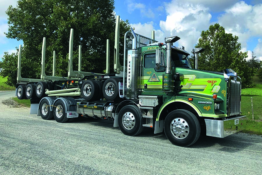
Okay, so then the discussion shifted to a fresh start – something completely different. Angus explains that he’d seen a Suzuki Vitara in a dark green and silvery gold – a combination that he thought would look good on a truck.
“I was was lucky enough that Peter Phillips liked them both.”
They added a lighter, lime green stripe to the two Suzuki colours, plus a fine yellow stripe to separate them…and they had the Aztec livery.
Well they did, once they figured what to do with the colour of the chassis. Ken explains: “So then we thought, ‘well we can’t go a red chassis – so that’s when we elected to go to what is pretty close to a British Racing Green for the chassis.”
The final touch to the colour scheme was the Aztec logo – designed by Peter Phillips, who Ken says, was “good with that sort of thing.”
He came up with a triangular design, with an internal triangle depicting two hands clasped in a handshake and the name Aztec below it – across the base of the outer triangle.
The company website explains that the choice of the name, logo and colour scheme were thoughtfully designed – reflecting the directors’ intention to “create a unique brand and name.”
The name, for instance, had to be both practical – as in a name that would be at the front of the telephone book (yep, still heavily in use back in the late Nineties) – but also meaningful.
Says the website: “The name Aztec came up. The Aztecs were an ancient Mayan civilisation that built a great empire; the Aztec directors felt that was something to aspire to, so the name and brand was developed.
“Forestry Transport Developments was added, as the directors wanted to develop forestry transport by way of innovation, quality, safety and service.”
In terms of the colour scheme, the decisions made by Ken Angus and Peter Phillips – and subsequently agreed-to by Steve Segetin – have remained in place for the near 23 years since.
Says Ken: “I found a painter and he painted my two trucks a few days later.” Peter and Steve’s trucks had the livery applied over the following six months, as they renewed their trucks.
Says Ken Angus of the livery, which earns Aztec the honours as this month’s finalist in the PPG Transport Imaging Awards: “Nothing has changed…” The treatment of the stripes on the cabovers were, of course, different to the conventionals – and that’s a difference that remains to this day.
Also, says Ken, where before yellow vinyl was used to define the stripes, “the painters of today can paint that.”
In 1998 just a handful of trucks wore the Aztec livery. Now the colour scheme – the base colour now known as Aztec Green, the Keen Gold (silvery gold) stripe and the light green stripe, each picked out by the fine yellow stripes – graces more than 100 log trucks working in the top half of the North Island.
Remarkably, the Aztec fleet – comprising trucks owned by 64 contractors in addition to those owned by the three company directors – is so widely varied, the colour scheme now appears on at least one example of all but one heavy-duty truck make available on the New Zealand market.
Despite the diversity of the lineup, the Aztec brand remains powerful and immediately recognisable – even though the directors have allowed contractors a free hand with the stripes.
Says Ken Angus: “People really love the colour scheme – ‘specially the owner-drivers. All we ask is that they use those colours to paint the trucks – “but they can have the stripes however they like. We just have to have signoff – to make sure it’s not too outrageous.”
The contractors are also able to give some prominence to their own company logos – although in the past couple of years, he says, “what we have enforced now is that the Aztec triangle has to go on the centre of the door…”
Ken Angus says it does give a sense of pride to see so many trucks now in the Aztec colours, but confesses, “it’s not something we envisaged.” When the forest owners adopted a policy of dealing with key suppliers, “some (in the logtruck industry) dropped off, and some went along for the ride….and it’s been one hell of a ride!”


 + EQUIPMENT GUIDE - FREE
