Double Coin Imaging Awards
Mercer’s colours in the TDM mix
Double Coin Imaging Awards
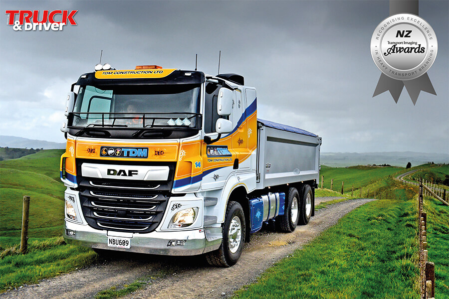
The inspiration for the sharp livery on the trucks run by Franklin company TDM Construction is an interesting mix of commercial and personal influences.
A couple of the icons on the company logo are pretty clearcut, straightforward: A digger bucket and a drainage pipe are cues taken from TDM’s civil construction and drainlaying business.
Then there’s the thistle icon: That’s all about the Scottish heritage of brothers Todd, Dean and Marc Black, who own and operate the company.
The bright yellow and royal blue stripes – which are painted on plain white cabs – are also family-inspired: They’re the colours of the Mercer Rowing Club….which the entire Black family has been actively involved in.
All of these influences were brought together in a collective effort by the brothers and their late father Peter (who had previously run his own contracting and trucking business) and gun Bombay signwriter Frank Bogaart.
The livery was created in 2009, when the company – which Todd and Dean had started five years earlier, as a small, specialist drainlaying operation – bought its first truck (an Isuzu tipper).
The company’s website says that it’s “a family business, built on family values” – and certainly there’s evidence of that in the fact that from the outset Todd and Dean had included younger brother Marc’s initial in the company name.…
Even though he was destined to go off and do a diesel mechanic’s apprenticeship with Southpac Trucks – and then subsequently work as a mechanic in Australia, before joining his brothers. He now fills the role of transport manager.
As Todd explains: “We knew Marc would join the business one day – that’s why we called it TDM!”
Until that first truck was added to its operation, TDM’s branding on its machinery was limited to the company logo, which had been designed for the startup by Todd and Dean. Until Bogaart D.Zign’s involvement, the logo icons were white on a black background – alongside a light blue TDM.
As Todd explains, with the arrival of the truck the brothers went to Bogaart with their logo and the blue and yellow colours they wanted to use (on white trucks): “We grew up around Mercer and they’re the colours of the Mercer Rowing Club.” The brothers and their parents have all been involved in the club – Mum Annette rowing there still.
Bogaart duly came up with the design of the wavy, upswept striping and the intricate pinstriping and scrollwork. All of which, Marc points out, is painted, not applied with vinyl: “Frank does it all by hand. The only stickers on it are the logos on the doors.
“People just assume that everything is stickered these days. But I know for a fact that our paint lasts longer than stickers.”
For instance, on a Kenworth T401 that, at seven or eight years old, is now the oldest fulltime truck on the fleet, “it’s the sticker that’s started peeling off – but the paint is still pretty tidy.”
Bogaart’s finishing touch was adding colours to the icons in the logo. They were happy with his design from the outset and didn’t change a thing.
And they haven’t since either – apart from having Bogaart adapt the design to suit each new truck model that’s joined the TDM fleet. That includes the current five DAFs (with two models) and five bonneted Kenworths, comprising two T401s, a couple of T409s and a 2020 T610SAR SAR.
Says Marc: “We just let Frank go for it. He’s the only one who’s ever painted our trucks.”
The wavy, upswept stripes on the sides of the cabovers have remained much the same as on the original Isuzu, but for the Kenworths the stripes extend forward from the cab, onto the sides of the bonnet, in an arrowhead design.
Todd says of the livery: “We love it. I’m really proud of the way our trucks are presented. They are our best of form of advertising.
“We are a civil construction business and the trucks are there to service that – so we’re not out there in the marketplace looking for business for our trucks. But they do create a good image for us.”
Marc has been a believer in the value of a well-presented truck since he was a kid who loved helping wash his Dad’s trucks (he had a couple of Kenworths) on Sundays.
“I was brought up in the era of blokes like Richie Malam, Ian Spedding and all of those sorts of guys – and the Old Man – and I saw how much pride they took in their trucks.”
So it’s satisfying that “now, with our trucks, we get comments occasionally from people – like ‘oh geez your trucks always look nice going down the road.’ ”
And he believes that the white base paint – lifted by the brightly-coloured striping – was an inspired choice: “They are a lot easier to keep clean. Being white, it’s not hard to run a brush over them and they look pretty good.”
Although the company’s core business is its civil construction and drainage work, a lot of that is carried out away from the public eye: “People don’t really see our machines all that often. Whereas our trucks, running up and down the motorway, a LOT of people see them.”
It’s a measure of the success of the TDM truck livery that the same design has, Todd points out, now been applied to other parts of the business: “It’s part of our branding company-wide now.”
 + EQUIPMENT GUIDE - FREE