Double Coin Imaging Awards
A simple scheme.... from a distance
Double Coin Imaging Awards
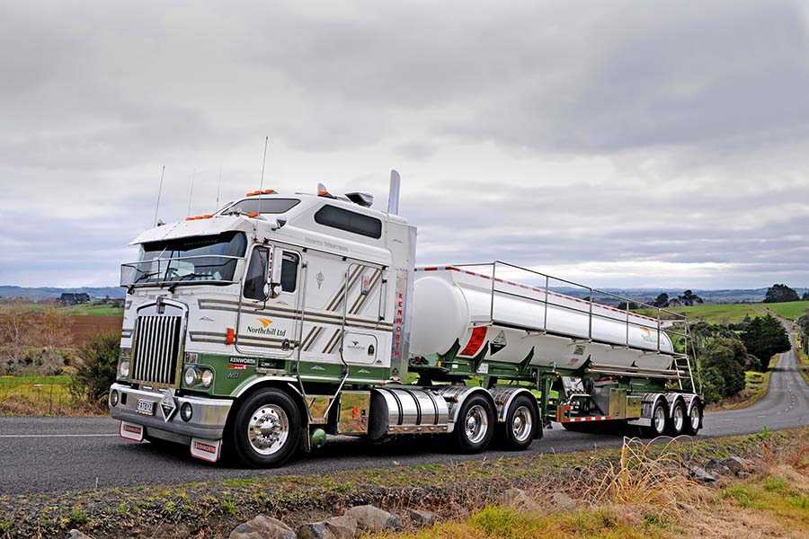
Some fleet colour schemes are so bold and complicated you can't help but notice – and, generally, admire them.
Others take a more subtle approach. Seen from a distance they're good-looking...but it takes a closer examination to uncover a depth of visual balance and understated detail that makes them really noteworthy.
This month's finalist in the PPG Transport Imaging Awards, Pukekohe-based Northchill, falls very much into this latter category.
At first glance its livery seems quite simple – a base white with green chassis, guards and lower cab, two sets of ruler-straight dual grey stripes running horizontally at mid-cab level, with similar sets crossing these and angling upward in the sleeper area.
The striping is set off by a golden yellow company logo – a swoosh with a central white line, evocative of a bend in a road. It's accompanied by the company name under it in green.
All very simple...and also very adaptable: With little modification it works as well on cabovers as it does on conventionals.
Subscribers: Please LOGIN to read the full article.
Some fleet colour schemes are so bold and complicated you can't help but notice – and, generally, admire them.
Others take a more subtle approach. Seen from a distance they're good-looking...but it takes a closer examination to uncover a depth of visual balance and understated detail that makes them really noteworthy.
This month's finalist in the PPG Transport Imaging Awards, Pukekohe-based Northchill, falls very much into this latter category.
At first glance its livery seems quite simple – a base white with green chassis, guards and lower cab, two sets of ruler-straight dual grey stripes running horizontally at mid-cab level, with similar sets crossing these and angling upward in the sleeper area.
The striping is set off by a golden yellow company logo – a swoosh with a central white line, evocative of a bend in a road. It's accompanied by the company name under it in green.
All very simple...and also very adaptable: With little modification it works as well on cabovers as it does on conventionals.
Scrollwork is minimal, while the fleet's trailer gear carries the approach to its limit, with several reefer units an unadorned white. The truck and trailer curtainsiders are almost as modest, carrying only the company name and logo at the rear of the trailer.
Move in close, though, and the detail is revealed. The broad grey stripes on the trucks carry fine yellow pinstripes, with a green stripe between each pair, while the boundaries of the green below are bordered by more light pinstriping.
The design dates back to around 2006. A couple of years earlier co-owners Graham and Michelle Redington had returned from Australia, where they had run a courier business, and bought a one-truck tanker operation carting timber treatment chemicals around the North Island.
The original unit was finished in a simple red and white, but with growth in the business the couple bought a set of ex-Orica GRP tanker B-trains. As Graham explains: "We needed to repaint them, so that was the opportunity to set up a colour scheme from scratch."
Soon after, they gained a substantial contract with Goodman Fielder to cart milk from Auckland to Northland. This was reflected in a new company name, Northchill, and a reduction over time in the timber treatment work.
So what dictated the choice of primary colour for the new design? Simple, says Graham: "I've always liked green, and the shade used by Godfrey Haulage took our fancy. It was actually called Godfrey's Green."
That mid-apple shade became the primary colour of the new scheme, applied over a base white to the chassis and lower cabs of the trucks, with an unobtrusive yellow stripe above. This has subsequently given way to the grey stripes.
The colour scheme was borrowed primarily from a trucking company in Australia that Graham had uncovered in a search on the Web.
The fleet's signwriting is handled by Cliff Mannington of Truck Signs at Mount Maunganui. Graham rates him so highly he says he remains quite hands-off with the process: "When we set up a new truck we just give it to Cliff and let him go. He's the best of the best – so particular and passionate.
"I've seen him get halfway through the signwriting on a truck, then decide the design wasn't quite what he wanted, so he's started again from scratch.
"One of Cliff's specialties is hand brushwork, which he uses for the Northchill name. And even when it is vinyl, like the pinstriping, he uses a clear coat on the ends to ensure they don't lift."
The company's new trucks now generally come with the green applied at the factory. But where touchup or repair work is needed Northchill uses either Fleet Image in Hamilton or Truck Smash Repairs in Auckland.
Around seven of the 21 linehaul units in the fleet are now finished in Foodstuff's yellow livery, since they're dedicated to the supermarket operator's work – on a contract that goes back to 2009.
Then there are Graham's "toys," a trio of Kenworths (a K200 Fat-Boy sleeper, a 2018 T900 Legend and a 2019 T659) finished in grey and silver....and enough handpainted pinstriping and scrollwork, chrome and stainless steel to fulfil the wildest dreams of the most eager owner-driver.
The Legend, especially, is a work of wonder, with the paint job a co-operative effort between Cliff Mannington and Australian custom truck maestro Justin Klos.
Forget anything remotely simple about this truck's livery: "I wanted to do something really special...." says Redington.
"I wanted it to be something like no one had seen before."

 + EQUIPMENT GUIDE - FREE