Double Coin Imaging Awards


More than a truck
Double Coin Imaging Awards
Running a fleet of trucks was, definitively, not what Aucklander Mark Geor's business was all about.
Rock and Rubble was established in late 2015 to provide cleanfill removal and tipping services in Auckland – with MD Geor opting to rely primarily on contracting other companies for its cartage needs.
"Initially, trucks were a no-go, given that we were trying to expand – and still are to some degree," he explains.
"But, obviously, the bigger we got, the more they became a necessary evil – as I put it!"
After a relatively low-key involvement – with a little 4x2 Isuzu and a secondhand Scania, their company branding limited to a black and white Rock and Rubble logo on a salmon pink background – last year Geor upped the ante….spectacularly.
Subscribers: Please LOGIN to read the full article.
Running a fleet of trucks was, definitively, not what Aucklander Mark Geor's business was all about.
Rock and Rubble was established in late 2015 to provide cleanfill removal and tipping services in Auckland – with MD Geor opting to rely primarily on contracting other companies for its cartage needs.
"Initially, trucks were a no-go, given that we were trying to expand – and still are to some degree," he explains.
"But, obviously, the bigger we got, the more they became a necessary evil – as I put it!"
After a relatively low-key involvement – with a little 4x2 Isuzu and a secondhand Scania, their company branding limited to a black and white Rock and Rubble logo on a salmon pink background – last year Geor upped the ante….spectacularly.
He explains: "So, the concept was, if you had to have them, they had to be more than a truck. That's why we went to town on them….in terms of a new livery and branding and what they are essentially.
"So they had to give us a bit of presence at the same time and help us push the brand out there."
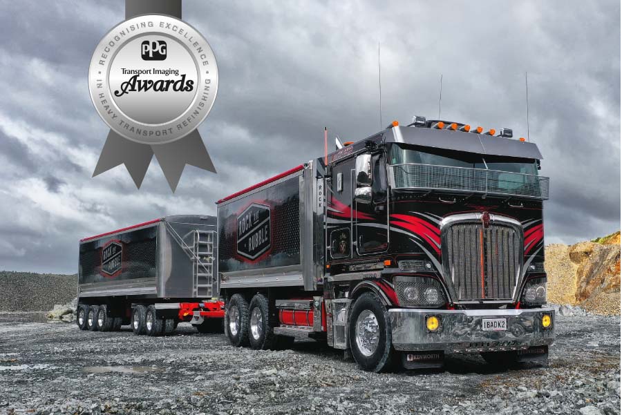
Hence he ordered up three tippers with eyecatching looks – a new Kenworth K200 6x4, a secondhand Kenworth T909 tractor unit and a new Scania R620 6x4.
The team at Rock and Rubble came up with the colours – a black base, an Audi silvery grey that Geor had seen on a friend's car, plus red for contrast.
"But after that we went in circles for a long while," says Geor – trying to get the detail right: "It was either too wacky, too modern and Euro-style, or too much in the traditional V-pattern often used on cabover Kenworths."
With a decision needed urgently so as not to delay the K200 going on the road, Geor sent its driver, Blair Shearer, down to imaging expert Darryn Caulfield, at Caulfield Signs in Rotorua.
Says Mark: "He was great – in the fact that he actually let us go down and workshop it, whereas no-one else would.
"We went down there and stayed for…I think it was two or three days. We had an idea of what we wanted…and basically he drew up some sketches and then we played around with the three colours."
For the multiple curved stripes on the cabs, Caulfield switched the emphasis away from the silver/grey being the primary colour – adopting the red instead.
The design for the bins is just as eyecatching – bordering the now silver and black logo with red, while creating a gravel-effect pattern with the silver, giving it a ragged grey edge – replicating a quarry working face or the edge of jaggedly-cut metal.
The signwriting on the cabs was carried out by Caulfield Signs, while the work on the bins was done by Sub Signs in Mangere and Peter Murray Painters in Pokeno was responsible for the paintwork.
Mark Geor is "very happy" with the effectiveness of the new colour scheme – and yes, it has lived up to his "more than a truck" expectations.
The look of the trucks is "serving the purpose, which is the main thing. It definitely has put us on the map to a greater degree. Much more presence.
"You know, just everyone notices them going up and down the motorway and 'oh shit, Rock and Rubble must be going really well.' "
And now the recognition has extended to Rock and Rubble being declared the winner of the 2019/2020 PPG Transport Imaging Awards – the four judges deciding that its colour scheme is the livery of the year.
Says a happy Geor: "We won something! We're doing something right then."
Along with the recognition of the award, Rock and Rubble also wins a commemorative trophy and a $2500 travel prize.
The winning livery scored 34 out of a possible 40 points in the judging, with PPG Industries New Zealand GM David White praising its "dramatic choice of colour and effect."
NZ Truck & Driver editor Wayne Munro rated it "an absolute standout – a show truck treatment on a serious working truck."
PPG's Mark Brearley high-scored it for its "very impacting visuals" and for having "a lot of character."
While Allied Publications director Hayden Woolston appreciated that the colour scheme helped launch "a relatively unknown business into the limelight."
The livery is set to become increasingly more visible around Auckland, with more Rock and Rubble truck and trailer units due on the road soon – another new Kenworth K200 and an International 9870.
The new company logo and the imaging on the bins is now also on another four Kenworths, operated by three of the trucking companies regularly carting for Rock and Rubble – an idea first applied with the company's former black and white and salmon-pink branding to a Volvo FM run by last year's PPG Transport Imaging Awards winner, N&J Woods.
It is, Geor confirms, something that will continue – "as long as the truck fits the criteria. I don't want an old-dunger floating around with the name on it."
Rock and Rubble recently extended its Auckland-based operation to Mount Maunganui and Mark Geor believes that the look of the trucks is now also helping it create a presence in the Bay of Plenty.
He's happy that the signage and imaging is standing up well to the tough tipper life: "The work we do inevitably means lots of dust and small knocks. The new scheme means the trucks still look smart, even under pretty challenging conditions."
He accepts that "a dirty truck is a working truck. But I mean they pretty much look good in all weather. If they get covered in shit you still notice them."


 + EQUIPMENT GUIDE - FREE
